Adding UIkit to Pinegrow: Pt 6
Namaste!
Welcome to part 6 of this tutorial. In this part, we will be covering an additional ‘key:value‘ pair for the options fields and talk about what values are made available to pass to helper functions. To pretty up our options, we will also discuss how to use the built-in ‘PgToggleButtonMaker()‘ function.
First, a quick recap! In the first part of this series, we learned how to set-up a plugin using the GitHub repo, plus a few of our own files. In the next part, we outlined bare bones of setting our plugin framework up. Next, in Part 3, we introduced the ‘PgComponentType‘ constructor – the workhorse of building our plugin. The ‘select‘ field property type was introduced and used to build the options for the UIkit Alert element. In the fourth part, we ran through most of the additional field property types. We also briefly touched on the ‘custom’ type, as well as the ‘get_value’ and ‘set_value’ keys –  we’ll be exploring those more in this part of the tutorial series. In part 5, we talked a little about loading in resources and then built a more complex element that allowed for the selection of icons from a pop-up modal.
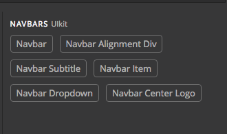
For this tutorial, we will focus on adding a complex UIkit element, the Navbar. My implementation has split it up into six different elements shown in the picture from the elements list. We will only be working on the first of those six, the main navbar element. Without further ado, the code:
var uikit_navbar = new PgComponentType('ui_navbar', 'Navbar', {
		selector: 'nav[uk-navbar]',
		tags: 'major',
		code:
			'\
		<nav class="uk-navbar-container" uk-navbar>\
			<div class="uk-navbar-left">\
				<ul class="uk-navbar-nav">\
					<li class="uk-active"><a href="#">Active</a></li>\
					<li>\
						<a href="#">Parent</a>\
						<div class="uk-navbar-dropdown">\
							<ul class="uk-nav uk-navbar-dropdown-nav">\
								<li class="uk-active"><a href="#">Active</a></li>\
								<li><a href="#">Item</a></li>\
								<li><a href="#">Item</a></li>\
							</ul>\
						</div>\
					</li>\
					<li><a href="#">Item</a></li>\
				</ul>\
			</div>\
		</nav>',
		on_changed: function(pgel) {
			var $nav_dropdown = pgel.find('.uk-navbar-dropdown');
			if ($nav_dropdown.length > 0) {
				pgel.data.navdropdown = true;
			} else {
				pgel.data.navdropdown = false;
			}
		},
		sections: {
			ui_navbar_options: {
				name: 'Navbar Options',
				fields: {
					ui_navbar_click: {
						type: 'checkbox',
						name: 'Enable click to toggle?',
						action: 'element_attribute',
						attribute: 'mode',
						value: 'click'
					},
					ui_navbar_transparent: {
						type: 'checkbox',
						name: 'Make navbar transparent?',
						action: 'apply_class',
						value: 'uk-navbar-transparent'
					},
					ui_navbar_dropbar: {
						show_if: function(data, pgel) {
							return testForNavbarDropdown(data, pgel);
						},
						type: 'checkbox',
						name: 'Make dropbar?',
						action: 'element_attribute',
						attribute: 'dropbar',
						value: 'true'
					},
					ui_navbar_mode: {
						show_if: function(data, pgel) {
							return testForNavbarDropdown(data, pgel);
						},
						type: 'select',
						name: 'Dropdown appearance mode?',
						action: 'element_attribute',
						attribute: 'dropbar-mode',
						on_changed: refreshPage,
						toggle_buttons: true,
						options: [
							{
								key: 'push',
								name: 'Push',
								html:
									'<div class="pg-tb-button pg-tb-button-text" style="font-weight: 700; color: white;" title="Push">Push</div>'
							},
							{
								key: 'slide',
								name: 'Slide',
								html:
									'<div class="pg-tb-button pg-tb-button-text" style="font-weight: 700; color: white;" title="Slide">Slide</div>'
							}
						]
					},
					ui_navbar_duration: {
						show_if: function(data, pgel) {
							return testForNavbarDropdown(data, pgel);
						},
						type: 'text',
						name: 'Dropdown animation duration (in milliseconds).',
						action: 'element_attribute',
						attribute: 'duration',
						on_changed: refreshPage
					},
					ui_navbar_show: {
						show_if: function(data, pgel) {
							return testForNavbarDropdown(data, pgel);
						},
						type: 'text',
						name: 'Delay in time to display dropbar on hover (in milliseconds).',
						action: 'element_attribute',
						attribute: 'delay-show',
						on_changed: refreshPage
					},
					ui_navbar_hide: {
						show_if: function(data, pgel) {
							return testForNavbarDropdown(data, pgel);
						},
						type: 'text',
						name: 'Delay in time to hide dropbar after hover ends (in milliseconds).',
						action: 'element_attribute',
						attribute: 'delay-hide',
						on_changed: refreshPage
					},
					ui_navbar_offset: {
						show_if: function(data, pgel) {
							return testForNavbarDropdown(data, pgel);
						},
						type: 'text',
						name: 'Offset for dropdown',
						action: 'element_attribute',
						attribute: 'offset',
						on_changed: refreshPage
					},
					ui_navbar_boundry: {
						show_if: function(data, pgel) {
							return testForNavbarDropdown(data, pgel);
						},
						type: 'checkbox',
						name: 'Add boundry alignment?',
						action: 'element_attribute',
						attribute: 'boundry-align',
						value: 'true',
						attribute_keep_if_empty: false,
						on_changed: refreshPage
					},
					ui_navbar_boundry_alignment: {
						show_if: 'ui_navbar_boundry==true',
						type: 'select',
						name: 'Boundry Alignment Position?',
						action: 'custom',
						attribute: 'align',
						toggle_buttons: true,
						attribute_keep_if_empty: false,
						options: [
							{
								key: 'left',
								name: 'Left',
								html: uikitButton.makeIcon('align-left', {
									attributes: {
										title: 'Left'
									}
								})
							},
							{
								key: 'center',
								name: 'Center',
								html: uikitButton.makeIcon('align-center', {
									attributes: {
										title: 'Center'
									}
								})
							},
							{
								key: 'right',
								name: 'Right',
								html: uikitButton.makeIcon('align-right', {
									attributes: {
										title: 'Right'
									}
								})
							},
							{
								key: 'none',
								name: 'None',
								html:
									'<div class="pg-tb-button pg-tb-button-text" style="font-weight: 700; color: white;" title="None">X</div>'
							}
						],
						on_changed: refreshPage,
						set_value: function(pgel, value) {
							if ('none' === value) {
								pgel.removeAttribute('align');
							} else {
								pgel.setAttribute('align', value);
							}
						}
					},
					ui_navbar_dropdown_width: {
						show_if: function(data, pgel) {
							return testForNavbarDropdown(data, pgel);
						},
						type: 'select',
						name: 'Number of dropdown columns',
						action: 'apply_class',
						toggle_buttons: true,
						options: [
							{
								key: '',
								name: '1'
							},
							{
								key: 'uk-navbar-dropdown-width-2',
								name: '2'
							},
							{
								key: 'uk-navbar-dropdown-width-3',
								name: '3'
							},
							{
								key: 'uk-navbar-dropdown-width-4',
								name: '4'
							},
							{
								key: 'uk-navbar-dropdown-width-5',
								name: '5'
							}
						],
						on_changed: refreshPage
					}
				}
			}
		}
	});
framework.addComponentType(uikit_navbar);“Holy Spaghetti Monster, that is a lot of code!” I hear you shouting. Yup, 225 lines give or take, but calm down, we will walk through them together.
Starting with the easy stuff:
var uikit_navbar = new PgComponentType('ui_navbar', 'Navbar', {
    selector: 'nav[uk-navbar]',
    tags: 'major',
    code:	'\
		<nav class="uk-navbar-container" uk-navbar>\
			<div class="uk-navbar-left">\
				<ul class="uk-navbar-nav">\
					<li class="uk-active"><a href="#">Active</a></li>\
					<li>\
						<a href="#">Parent</a>\
						<div class="uk-navbar-dropdown">\
							<ul class="uk-nav uk-navbar-dropdown-nav">\
								<li class="uk-active"><a href="#">Active</a></li>\
								<li><a href="#">Item</a></li>\
								<li><a href="#">Item</a></li>\
							</ul>\
						</div>\
					</li>\
					<li><a href="#">Item</a></li>\
				</ul>\
			</div>\
		</nav>',
First up we let Pinegrow know we are defining a new component type with ‘new PgComponentType‘ and assigning it to the ‘uikit_navbar‘ variable. We pass in the unique type and name as the first two components, then the rest of the component as an object containing a series of key:value pairs – looks familiar, right?
The first key is ‘selector‘ and allows Pinegrow know what element to change and to bring our options up when the element is highlighted on the screen or in the tree. In this case, a ‘<nav>‘ html tag with an attribute of ‘uk-navbar‘. Next, the ‘tags‘ tells Pinegrow we want the element painted orange in the tree – notifying the user that it has changeable options. Finally, the value of the ‘code‘ key is our actual HTML coding for the navbar element. In this case, in order to split the code onto multiple lines I’m using the ‘\‘ character. Some style guides call this a no-no, but I find it makes the code a little easier to follow.
on_changed: function(pgel) {
    var $nav_dropdown = pgel.find('.uk-navbar-dropdown');
    if ($nav_dropdown.length > 0) {
        pgel.data.navdropdown = true;
    } else {
        pgel.data.navdropdown = false;
    }
},
We briefly touched on the ‘on_changed‘ key in the last tutorial. Basically, it sets up a listener on the Node (fancy talk for how Pinegrow handles our HTML) that we are inserting. If any change happens to that Node it will trigger the function we give as a value.
As you notice, I’m passing in one argument to this function, ‘pgel‘. It is my preferred way to reference the actual Node that is being added to the page – I could also call it ‘pgnode‘ or even ‘billy‘. At this point in our component, we have two Pinegrow supplied objects that we can pass to our function – the Node, and a reference to the entire page – often referred to as ‘crsapage‘. They are always passed in the same order and will be assigned to whatever arguments we are passing. So what do those look like in the terminal?

Again, this is the Node that Pinegrow is actually managing and that we will interact with and alter when we want to add special classes or attributes.

The full console.log of the ‘crsapage‘ object is huge, so I’m only displaying a portion here. To see the whole thing you can open up the developer’s tools. This can be done by either right-clicking on the Pinegrow icon on the upper left, or by using some code in your plugin. I find that I need it open all the time, so I add the following line into my plugin just after the framework definition (Thanks to Imran in the FB group for reminding me about this!) :
	//added in for debugging
	require('nw.gui').Window.get().showDevTools();
Just remember to remove that set of lines from your production version!
Back to the actual ‘on_changed‘ value. Again, it is a function with ‘pgel‘ as an argument. We then use some fairly standard jQuery ‘.find‘ to determine if there is an element with a ‘uk-navbar-dropdown‘ class within the Node code. If found it assigns the pgel object ‘data.navdropdown‘ a value of ‘true‘, otherwise, it sets it to ‘false‘. You can see in the image above, about a third of the way down, that it is set to ‘true‘. We will come back to how we are using this as we dig farther through the code.
sections: {
    ui_navbar_options: {
        name: 'Navbar Options',
        fields: {
This section of code just allows us to add our options sections and populate it with all of our selectors. For the sake of brevity – yeah right, Bo – I’m going to skip most of these. They should be fairly self-explanatory. Instead, we will start with the third field ‘ui_navbar_dropbar‘:
ui_navbar_dropbar: {
	show_if: function(data, pgel) {
		return testForNavbarDropdown(data, pgel);
	},
	type: 'checkbox',
	name: 'Make dropbar?',
	action: 'element_attribute',
	attribute: 'dropbar',
	value: 'true'
},
The first key of this object is 'show_if‘. This key expects a boolean value that can be derived from checking other fields or passing a function to it. It will only show the field if it returns ‘true‘. So, for example, we could use:
show_if: "ui_navbar_transparent === 'uk-navbar-transparent'" This would only show our current field if the previous field named ‘ui_navbar_transparent‘ (see code way above) had a value of ‘uk-navbar-transparent‘. This will only happen if the checkbox has been ticked for this option. Otherwise, it will have a value of ‘null‘. Which gives us yet a shorter way to check:
show_if: "ui_navbar_transparent" This will throw ‘false‘ if no value is assigned this key!
‘Enough with the meandering!‘, I hear you shout. I just have to say that you are very shouty today! Going back to the ‘show_if‘ from the code – I’m passing a function with two arguments. Again, Pinegrow exposes several objects in a specific order for us to utilize in our functions. In this case, within a field element, it exposes seven objects, but we are interested in number two, our old friend ‘pgel’. The first ‘data’ contains all of the current values for the fields in that section. Okay, so what function am I passing those arguments to? Here you go:
var testForNavbarDropdown = function(data, pgel) {
	if (pgel.data.navdropdown == true) {
		return true;
	} else {
		return false;
	}
};
This little helper can be inserted anywhere in your main plugin JS file. I prefer to keep it near to my navbar ‘PgComponentType‘ definition for neatness. So what does it do? It returns a boolean depending on the value we set in the ‘on_changed‘ function.
Okay, let’s look at the next field for a way we can make our display a little more attractive.
ui_navbar_mode: {
	show_if: function(data, pgel) {
		return testForNavbarDropdown(data, pgel);
	},
	type: 'select',
	name: 'Dropdown appearance mode?',
	action: 'element_attribute',
	attribute: 'dropbar-mode',
	on_changed: refreshPage,
	toggle_buttons: true,
	options: [
		{
			key: 'push',
			name: 'Push',
			html:
				'<div class="pg-tb-button pg-tb-button-text" style="font-weight: 700; color: white;" title="Push">Push</div>'
		},
		{
			key: 'slide',
			name: 'Slide',
			html:
				'<div class="pg-tb-button pg-tb-button-text" style="font-weight: 700; color: white;" title="Slide">Slide</div>'
		}
	]
},
Most of this code should be familiar. A ‘select‘ that changes an attribute, but we only have two choices. Is there a better way to show this? I think so! As you can see there is a new ‘key:value‘ pair before the ‘options‘. The ‘toggle_buttons‘ key changes how your options are displayed. You can also see that we have to pass an additional ‘key:value‘ pair for each of our ‘options‘ objects. The ‘html‘ key receives any HTML we would like to display. Pinegrow wraps each of the buttons in click listeners for us. In this case, I’m taking advantage of the native animation and CSS built into Pinegrow by putting the ‘pg-tb-button' and ‘pg-tb-button-text‘ classes onto the ‘<div>‘. Pinegrow also uses the ‘title‘ attribute to fill in the tooltip on hover. I also decided to add some inline styling to make them pop a bit.
Using toggle buttons is better than a dropdown for small numbers of choices, I think. However, please note that you have to write a custom function if you don’t want either of your choices selected.
Okay, I can hear you muttering, “Wouldn’t it be cool if we could do that with icons?” Well, we can!
ui_navbar_boundry_alignment: {
	show_if: 'ui_navbar_boundry==true',
	type: 'select',
	name: 'Boundry Alignment Position?',
	action: 'custom',
	attribute: 'align',
	toggle_buttons: true,
	attribute_keep_if_empty: false,
	options: [
		{
			key: 'left',
			name: 'Left',
			html: uikitButton.makeIcon('align-left', {
				attributes: {
					title: 'Left'
				}
			})
		},
		{
			key: 'center',
			name: 'Center',
			html: uikitButton.makeIcon('align-center', {
				attributes: {
					title: 'Center'
				}
			})
		},
		{
			key: 'right',
			name: 'Right',
			html: uikitButton.makeIcon('align-right', {
				attributes: {
					title: 'Right'
				}
			})
		},
		{
			key: 'none',
			name: 'None',
			html:
				'<div class="pg-tb-button pg-tb-button-text" style="font-weight: 700; color: white;" title="None">X</div>'
		}
	],
	on_changed: refreshPage,
	set_value: function(pgel, value) {
		if ('none' === value) {
			pgel.removeAttribute('align');
		} else {
			pgel.setAttribute('align', value);
		}
	}
}
Here is another example from the UIkit Navbar element. Our new friend ‘toggle_buttons‘ is there! Our ‘options‘ looks almost the same, but we have a change to our ‘html:‘. Instead of straight HTML, we are chaining something called ‘uikitButton‘ to ‘makeIcon‘ and passing in some arguments. Well gentle people, step behind the curtain to see how the sausage is made! The ‘uikitButton‘ is linked to a function provided by Pinegrow called ‘PgToggleButtonMaker()‘ defined in the ‘lib’ -> ‘crsa’ -> ‘tools’ -> ‘pg.panel.js’ file. In my helper functions near the top of my plugin I added the following code:
//This instantiates our button maker
	var uikitButton = new PgToggleButtonMaker();
To the ‘PgToggleButtonMaker()‘ we are chaining another function, ‘makeIcon()‘ that was defined within the ‘PgToggleButtonMaker()‘ function. It accepts two arguments – ‘icon‘, which is an icon name from the Pinegrow icons, and an array of options. In turn, these are passed to an additional function that takes up to four arguments – ‘options‘, ‘text‘, ‘classes‘, and ‘tag'. The ‘makeIcon()‘ function supplies the last three of those setting them to '', ‘”pg-tb-button-icon icon icon-"+ icon‘, and ‘i‘, respectively.
In the cases above, I’m passing in the icon name and the ‘title‘ attribute to populate the tooltip. “So, where do the icon names come from Bo?” Thanks for the question and not shouting this time! They are all listed out in a file ‘pg-new-icons’ -> ‘all-icons.html’.

Examining the code gives a nice list of all the names. These are

derived from a set of custom icomoon icons. I haven’t put in the effort to try and load in a customized icon set at this point in time. Theoretically, it might require only injecting custom CSS to bring the icons in using ‘@font-face‘ plus some additional styling – maybe!
In addition to passing in attributes, the ‘makeIcon()‘ function can take one other type of option, ‘styles‘. The ‘styles‘ key should receive an object containing CSS ‘key:value‘ pairs. For example:
html: uikitButton.makeIcon('align-center', {
	styles: {
		color: 'green',
		background: 'white'
	},
	attributes: {
		title: 'Center'
	}
})
This would result in an icon with a green color and white background. You can use any logical CSS.
The ‘PgToggleButtonMaker‘ exposes three additional functions – ‘makeColor‘, ‘makeColorText‘, and ‘makeText‘. The ‘makeColor‘ allows you to add a piece of text with a specified background color or even a background image passed in:
html: uikitButton.makeColor("url('file')",'X',{
        "use-background-image": true
})
Having written this, I’m not sure as it is useful because the URL has to be in relation to the Pinegrow App ‘package.json‘ file, not to your plugin.
******************************************
Addendum: I suppose you could wrestle with passing in the file using the ‘getResourceFile()‘ function, not positive. If someone wants to try it and make comment, then an antecedent, ‘Thank You!’.
******************************************

The ‘makeColorText‘ accepts three arguments, but basically returns a stylized capital ‘A’ in the specified color.

The final function is ‘makeText‘ which accepts two argument – ‘text’ and ‘options’.
html: uikitButton.makeText('X' , {
		styles: {
		color: 'green',
		background: 'white'
	},
	attributes: {
		title: 'Center'
    }
)
Okay, just a little bit left. Again, one of the problems with the ‘toggle_buttons‘ is the lack of a way to automatically remove an attribute or class. To get around this I added in a ‘set_value’ to the boundary alignment option. This allows us to evaluate either the choices that the user made or the DOM itself before deciding the value of ‘value‘.
set_value: function(pgel, value) {
	if ('none' === value) {
		pgel.removeAttribute('align');
	} else {
		pgel.setAttribute('align', value);
	}
}
This function receives two arguments – the element ‘pgel‘ and the ‘value‘ that was just selected. If the user selects the ‘X’ at the end than we are using to delete the element the value will be set to ‘none‘. If this is true we use ‘removeAtrribute‘ to get rid of the ‘align‘ attribute. Otherwise, we use ‘setAttribute‘ to give ‘align’ the desired value. In this case, we don’t need to use ‘get_value’, since it is being passed from the option list. One case for this is for text selectors where the existing value could be anything. Here is an example:
get_value: function(pgel) {
	var pgreplace = pgel.findOne('replace');
	if (!pgreplace) return null;
	var text = pgreplace.text();
	return text;
},
In this case, we are passing in the ‘pgel‘ Node reference. We then parse that Node to see if there is any text within ‘<replace></replace>‘ tags. If it does exist it returns that text to Pinegrow to display within the option. I used this for the UIkit Navbar subtitle element – here is the inserted code:
<div class="uk-navbar-subtitle">
    <replace>Subtitle</replace>
</div>
The result in the option block looks like this: 
That is it! If you look through the rest of the long code block above, all of the other option fields should be self-explanatory. You will also notice that  I’ve included another shorthand way to use ‘
toggle_buttons‘ – don’t bother with the ‘html‘ key!
To summarize, in this tutorial I covered the various objects Pinegrow exposes for use in our custom functions, how to conditionally display our options, and some ways to add some styling to our options. Finally, I walked through an example of both ‘set_value‘ and ‘get_value‘. Hopefully, this is helpful to someone out there to move their own projects along!
As always, I’m open to any comments or criticisms. If you would like a specific question addressed or something clarified, reach out in the comments or by e-mail. Happy Programming!
Metta!!
Update: I have now finished a full-length version of the UIkit plugin for Pinegrow. Purchase of this plugin not only adds the UIkit framework to Pinegrow for unlimited sites, but it also gives you access to the completed code for learning purposes! As a bonus, I’ll give you access to a Facebook page to discuss coding for Pinegrow. Click here to learn more!!
